June 21st is #ShowYourStripes day

#ShowYourStripes day is coming up — on June 21st, the summer (or winter) solstice in the Northern Hemisphere — a day to spread awareness about climate change using the iconic warming stripes graphics that show temperature trends over the last 100+ years.

A series of vertical colored stripes representing global annual average temperatures from 1850 to the present. The colors transition from deep blue (cooler years) on the left to deep red (hotter years) on the right, visually illustrating the steady rise in global temperatures over time.

Each colored stripe represents the average temperature of a given year, relative to a long-term baseline. Blue means cooler, red means hotter. The result? A striking visual that makes the pace of global warming impossible to ignore.

No charts, no numbers. Just color—and the undeniable trend we’re living through.

I’ll be joining in again this year, and I invite you to do the same. Let’s keep making climate change visible.

More info here: https://www.climatecentral.org/stripes-information
Download your own stripes: https://showyourstripes.info/

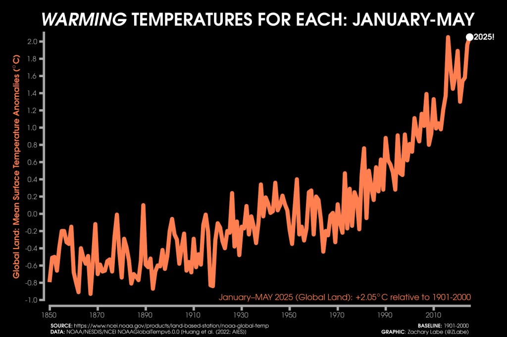
And if you still need a reminder of how fast the planet is warming, just look at this.

Line graph showing global land surface temperature anomalies from 1850 to May 2025. The trend line starts below average in the 19th century and rises sharply in recent decades, with 2025 reaching +2.05°C above the 1901–2000 average. The data visually emphasizes the acceleration of global warming.
Global land temperatures from January to May 2025 were +2.05°C above the 1901–2000 average. The trend is no longer subtle.
This entry was posted in Actualidad, Climate crisis, English, Nature and tagged , , , , . Bookmark the permalink.

Leave a comment

This site uses Akismet to reduce spam. Learn how your comment data is processed.